

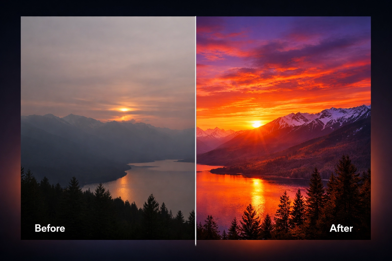
Lightroom presets promise effortless, professional-looking photos with a single click. The reality? They're powerful tools that can transform your workflow: but only when you use them correctly. Too many photographers download stunning presets, apply them to their images, and wonder why the results look artificial, inconsistent, or downright disappointing.
The truth is, presets aren't magic wands. They're sophisticated starting points that require understanding and finesse to unlock their full potential. If your edited photos aren't living up to expectations, you're likely making one (or several) of these common mistakes. Let's dive into what's holding your images back and, more importantly, how to fix it.
Mistake #1: Treating Presets as One-Click Solutions
Here's the fundamental truth many photographers overlook: presets are starting points, not final destinations. When you expect a preset to deliver perfect results without any adjustment, you're setting yourself up for disappointment.
Every photo you shoot carries unique characteristics: different lighting conditions, varied color temperatures, distinct subjects, and countless environmental variables. A preset developed for golden hour beach portraits won't magically transform your overcast cityscape into perfection without customization.
The fix: Choose three to five presets that align with your aesthetic vision, then commit to tweaking them for each individual photo. This approach creates consistency across your portfolio while allowing the flexibility each image demands. Adjust the preset's intensity, modify specific color channels, or refine exposure values to ensure each photo receives the attention it deserves.
Mistake #2: Skipping Fundamental Adjustments First
Applying a preset before addressing basic image issues is like painting a wall without priming it: you might get some color on there, but the results will be suboptimal at best.
Before you even think about applying your favorite preset, your photo needs proper foundational adjustments. Dark shadows become impenetrable black holes. Blown-out highlights lose all recoverable detail. Unnatural color casts poison the entire color palette. When you apply a preset to these flawed images, you're simply amplifying existing problems.
The fix: Establish this pre-preset workflow:
- Exposure correction comes first: ensure your image isn't unnaturally bright or dark
- Contrast adjustment creates balanced tonal range across highlights, midtones, and shadows
- White balance correction eliminates unwanted color tints that throw off your entire palette
These three adjustments create the clean canvas your preset needs to truly shine. Think of them as the foundation of a house: skip them, and everything built on top becomes unstable.
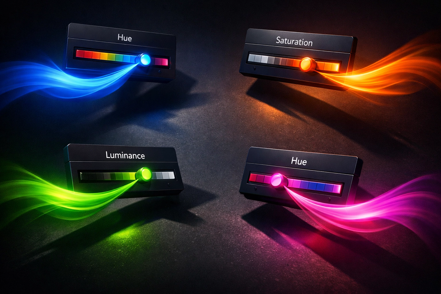
Mistake #3: Overprocessing Saturation and Vibrance
We've all seen them: photos so saturated they look like they've been soaked in radioactive paint. Oversaturation remains one of the most common telltale signs of amateur editing, yet it's remarkably easy to fall into this trap.
When you push saturation and vibrance sliders too far, you create unnatural, over-processed images that scream "I don't know when to stop." Colors become garish, skin tones turn orange or magenta, and the subtle nuances that make photos feel authentic disappear entirely.
The fix: Master the HSL (Hue, Saturation, Luminance) sliders for surgical precision. Instead of globally increasing saturation, target individual color channels. Boost the blues in your sky without affecting skin tones. Enhance the greens in foliage while keeping reds natural.
Adjust saturation in small increments: think 5-10% at a time: and remember that different photography genres require different approaches. Landscapes can handle more vibrant colors, while portraits demand restraint to preserve lifelike skin tones. When editing portraits, pay particular attention to oranges and reds, which directly impact how natural skin appears.
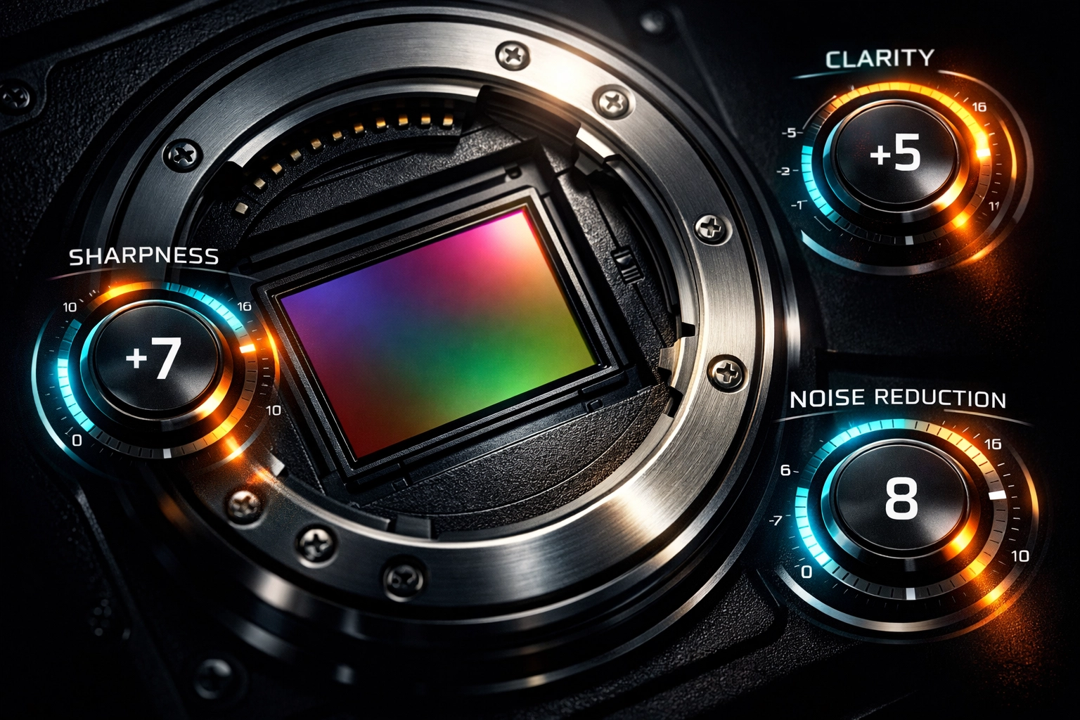
Mistake #4: Ignoring the Fine Details
You've nailed the overall color grading and exposure. The composition works. The colors feel right. But something's still off: the image lacks that polished, professional quality you're chasing.
The culprit? You're overlooking the subtle refinements that separate amateur edits from professional work. Sharpness, clarity, texture, and noise reduction might seem like minor adjustments, but they're absolutely paramount to creating images that command attention.
The fix: After applying and customizing your preset, dedicate time to these finishing touches:
- Sharpening brings critical detail to important elements like eyes in portraits or key architectural features
- Clarity adds midtone contrast that makes images pop without appearing over-processed
- Texture enhances fine detail while preserving larger tonal transitions
- Noise reduction eliminates digital grain in high-ISO images while preserving essential detail
These adjustments work synergistically: too much sharpening amplifies noise, while excessive noise reduction destroys the detail sharpening tries to enhance. Find the balance through careful, incremental adjustments while viewing your image at 100% zoom.
Mistake #5: Creating Inconsistent Edits Across Series
Nothing disrupts visual storytelling faster than jarring inconsistency between photos in a series. You've seen it in wedding albums where skin tones shift from image to image, or landscape collections where color palettes clash rather than complement.
When you apply presets unevenly or fail to account for varying lighting conditions across a shoot, you create a disjointed viewing experience that undermines your entire body of work.
The fix: Build a cohesive visual narrative by adjusting presets to maintain consistency despite changing conditions. If you're editing a wedding where you shot in both natural outdoor light and warm indoor reception lighting, your preset application needs to compensate for these differences.
Create reference images from each lighting scenario, then match subsequent photos to these anchors. This approach maintains your stylistic signature while adapting to the unique characteristics of each scene. The goal isn't making every photo identical: it's ensuring they feel like they belong to the same visual family.
Mistake #6: Baking White Balance and Exposure into Your Presets
This technical mistake sabotages preset flexibility before you even apply them. When you save white balance and exposure adjustments within a preset itself, you're creating a rigid tool that struggles to adapt to different lighting conditions.
Imagine applying a preset created under warm sunset lighting to a photo shot in cool morning shade. The baked-in warm white balance creates an orange nightmare, while the exposure settings designed for bright light leave your shadowy image improperly exposed.
The fix: When creating or customizing presets, uncheck the white balance and exposure boxes in your preset settings. This simple step transforms rigid presets into flexible tools that maintain their stylistic signature across vastly different lighting scenarios.
Instead, adjust white balance and exposure individually for each photo based on its specific conditions, then apply your preset. This workflow preserves the creative look you're after while ensuring technical accuracy across diverse shooting situations.
Mistake #7: Using Incorrect Camera Calibration Settings
Here's a technical mistake that often flies under the radar but creates significant problems, especially for photographers who shoot with multiple lenses or camera bodies.
When creating presets, setting lens corrections to "Custom" instead of "Auto" creates mismatches when applying those presets to photos shot with different equipment. Your preset might look perfect on images from your 50mm prime but create distortion or vignetting issues when applied to photos from your wide-angle zoom.
The fix: Enable "Auto" for lens corrections within your preset settings. This intelligent setting allows Lightroom to read each image's EXIF data, identify the specific lens used, and apply appropriate corrections automatically.
This approach ensures your presets maintain their creative look while adapting technically to equipment variations. Whether you shot with a wide-angle, standard, or telephoto lens, Lightroom applies the right geometric and chromatic corrections before your preset's creative adjustments take effect.
Transform Your Editing Workflow
Mastering Lightroom presets isn't about downloading more options or finding that one magical filter: it's about understanding how to leverage these powerful tools intelligently. When you avoid these seven common mistakes, your presets transform from disappointing shortcuts into indispensable workflow accelerators.
The most successful photographers don't just collect presets; they develop systematic approaches that combine preset efficiency with thoughtful customization. They understand that consistency comes from methodology, not just from applying the same filter to every image.
Ready to elevate your entire creative toolkit? Explore Design Vault's comprehensive Adobe collection for professional resources that complement your photography workflow. From advanced editing assets to design tools that help you showcase your photography professionally, investing in quality resources accelerates your creative journey.
Your photos deserve better than one-click solutions and cookie-cutter edits. Embrace these fixes, develop your systematic approach, and watch your photography flourish into the polished, professional work you've been striving to create.