

Lightroom presets are transformative tools that can elevate your photography workflow from tedious to seamless, yet most photographers unknowingly sabotage their results through common missteps that undermine the very efficiency they're seeking. Whether you're a portrait photographer racing against delivery deadlines or a landscape shooter building a cohesive portfolio, understanding these critical mistakes: and how to fix them: separates amateur edits from professional-grade imagery.
The truth is, presets are powerful starting points, not magical finish lines. When wielded correctly, they unlock consistency, speed, and a signature aesthetic that makes your work instantly recognizable. When misused, they create flat, overly processed images that scream "preset filter" rather than artistic vision. Let's dive into the seven most damaging mistakes you're likely making and transform your preset workflow into something remarkable.
Mistake #1: Treating Presets as One-Click Magic
The Problem: You apply a preset, export immediately, and wonder why your images look generic or disconnected from your creative vision.
This approach treats presets like Instagram filters: convenient but limiting. The most successful photographers understand that presets are foundations, not complete solutions. When you rely entirely on one-click applications, you sacrifice the unique characteristics of each image: its specific lighting conditions, subject matter, and emotional tone.
The Fix: Choose three to five presets that align with your aesthetic direction, then customize them for each photo. Adjust the preset's intensity using the opacity slider (if your editing software supports it), or manually dial back the settings that feel too aggressive. This approach maintains consistency across your portfolio while honoring the individuality of each capture.
Think of presets as recipes you adapt based on available ingredients: the core formula remains, but you season to taste.
Mistake #2: Skipping Fundamental Adjustments First
The Problem: You import photos and immediately apply your favorite preset without addressing basic exposure, contrast, or white balance issues.
This sequence creates compounding problems. A preset designed for well-exposed images will amplify existing exposure issues, turning slightly dark shadows into impenetrable black holes or pushing bright highlights into blown-out whites. Your preset can't compensate for fundamental technical deficiencies: it only enhances what's already present.
The Fix: Establish a pre-preset checklist that you run through for every image:
- Correct exposure using the exposure slider until highlights and shadows fall within acceptable ranges
- Adjust white balance to neutralize unwanted color casts or establish intentional temperature
- Set black and white points to ensure full tonal range
- Apply lens corrections to eliminate distortion and vignetting
Only after these foundational adjustments should you apply your preset. This workflow ensures your preset works with a properly prepared canvas rather than attempting to rescue a technically flawed image.
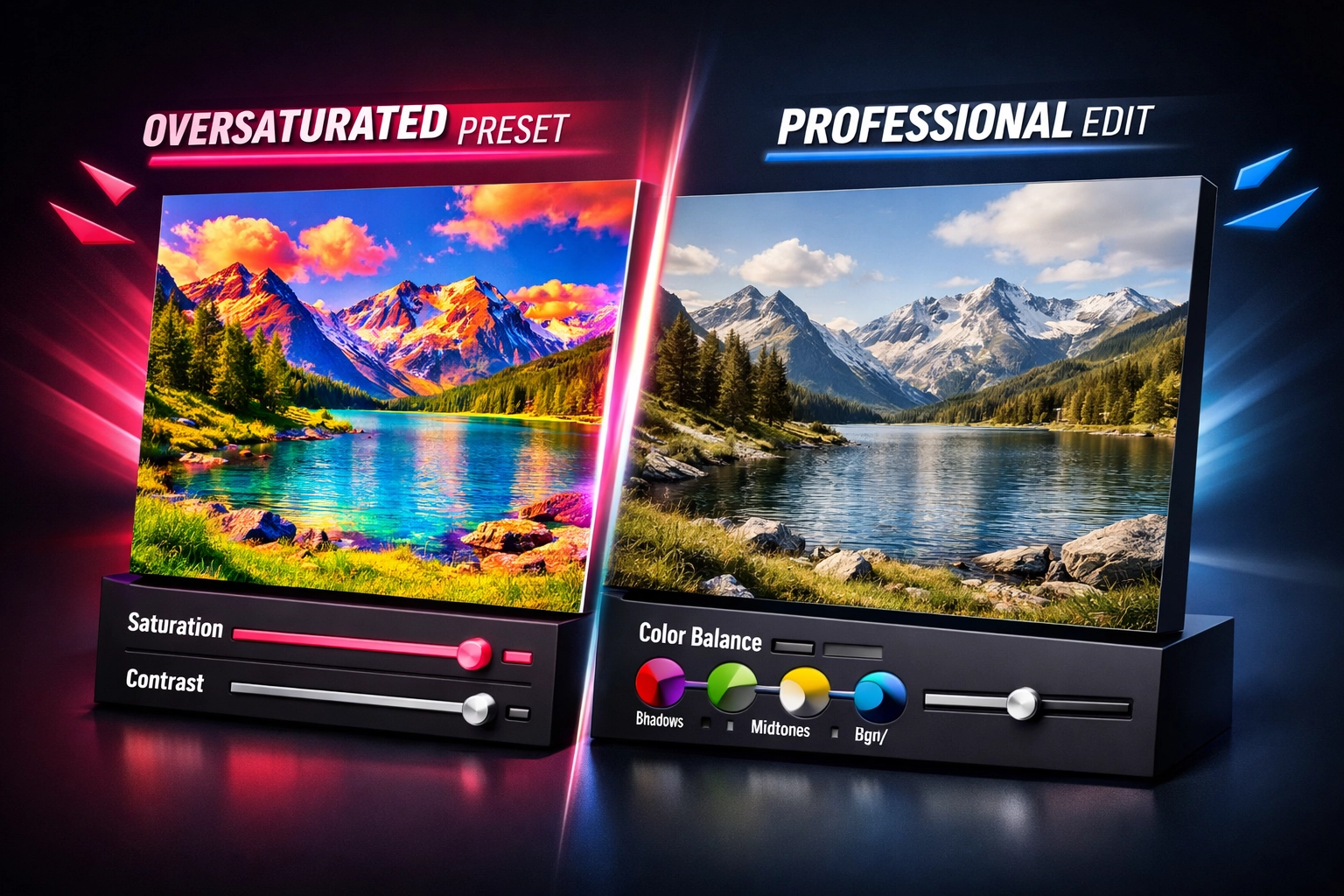
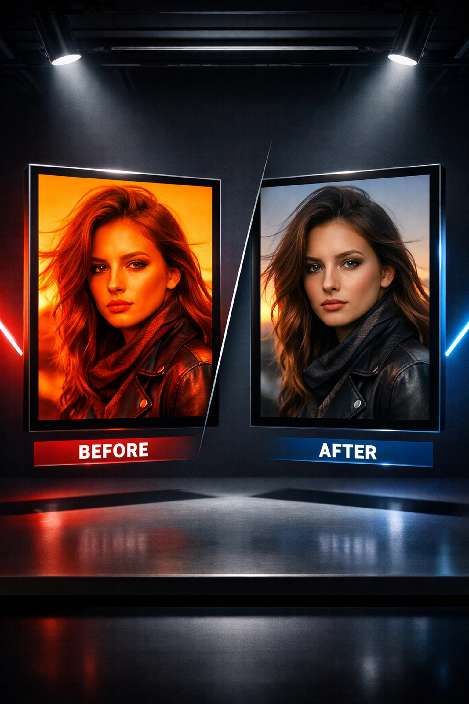
Mistake #3: Pushing Saturation and Vibrance Too Far
The Problem: Your images look artificially vibrant, with colors that seem to leap off the screen in unnatural ways, particularly in skin tones that veer toward orange or magenta.
Oversaturated images initially feel exciting and bold, but they fatigue the eye quickly and date your work. Viewers instinctively recognize when colors have been pushed beyond reality, undermining the authenticity of your photography.
The Fix: Exercise restraint with global saturation and vibrance adjustments. Instead of pushing these sliders to +40 or +50, make subtle adjustments in 5-10% increments and evaluate the impact on different elements within your frame.
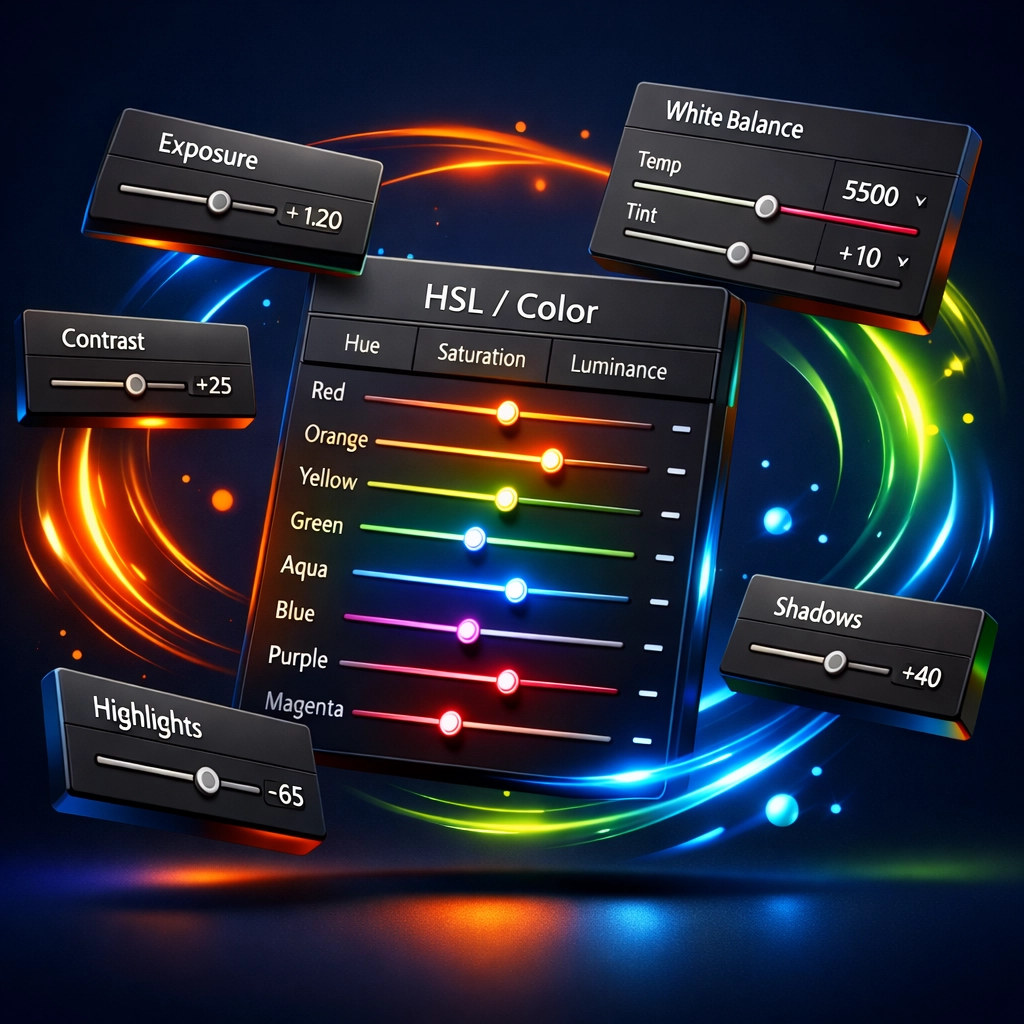
More importantly, embrace the HSL panel (Hue, Saturation, Luminance) for surgical color control. Rather than boosting all colors equally, target specific channels that need enhancement. For portraits, slightly desaturate oranges to create more natural skin tones. For landscapes, boost blue saturation in skies while keeping foliage more muted for visual hierarchy.
This selective approach creates sophisticated, nuanced color palettes that enhance rather than overwhelm your compositions.
Mistake #4: Ignoring Fine-Tuning Details
The Problem: You focus exclusively on color grading and tonal adjustments while neglecting sharpness, clarity, texture, and noise reduction: the details that separate amateur edits from professional finishing.
An image with beautiful colors but soft focus or excessive noise undermines your credibility. These technical refinements might seem minor individually, but collectively they create the polish that distinguishes high-end work.
The Fix: Develop a consistent finishing workflow that addresses these technical elements:
- Sharpening: Apply appropriate sharpening based on subject matter (portraits need less than architecture or landscapes)
- Clarity and texture: Use clarity for midtone contrast and texture to enhance fine details without affecting color
- Noise reduction: Balance luminance and color noise reduction, particularly for high-ISO images
- Grain: Consider adding subtle grain for a film-like aesthetic that can actually make digital images feel more organic
These adjustments might add two minutes to your workflow per image, but they dramatically elevate the perceived quality of your final output. For photographers looking to expand their creative toolkit beyond presets, consider exploring comprehensive resources like the Adobe Master Collection to unlock additional tools and techniques.
Mistake #5: Applying Inconsistent Edits Across Series
The Problem: You apply presets inconsistently across photo series: weddings, client sessions, or portfolio collections: creating jarring visual jumps that disrupt narrative flow.
This mistake becomes especially apparent in wedding albums where one image features warm, golden tones and the next shifts to cool, desaturated blues. Your individual images might look stunning in isolation, but together they feel disjointed and unprofessional.
The Fix: Before applying presets to an entire series, analyze the shooting conditions for each subset of images. Group photos by similar lighting scenarios: outdoor natural light, indoor tungsten, mixed lighting, golden hour, etc.
Apply your base preset to the first image in each lighting group, make necessary adjustments, then sync those specific settings across similar images. This approach maintains cohesion while accounting for the inevitable variations in real-world shooting conditions.
For large batches, consider creating lighting-specific preset variations: "My Style – Indoor," "My Style – Golden Hour," "My Style – Overcast." This system streamlines your workflow while preserving consistency across diverse conditions.
Mistake #6: Including Exposure and White Balance When Creating Presets
The Problem: When you create custom presets, you include exposure and white balance adjustments that worked for one specific image but create problems when applied to photos shot under different conditions.
This fundamental flaw in preset creation forces you to manually correct these settings for every application, defeating the efficiency presets should provide.
The Fix: When creating new presets, consciously exclude white balance and exposure adjustments by unchecking those boxes in the preset creation dialog. Your preset should focus on the stylistic elements you want to replicate: color grading, tone curve, split toning, HSL adjustments: while leaving technical corrections flexible.
This approach allows you to apply your signature look while maintaining the ability to quickly adjust exposure and white balance independently based on each image's unique requirements. The result is a truly versatile preset that adapts to diverse shooting conditions without constant manual intervention.
If you're building a library of creative assets beyond photography, the Graphic Design Bundle offers complementary resources for photographers expanding into client deliverables and marketing materials.
Mistake #7: Using Custom Lens Corrections Instead of Auto
The Problem: You create presets with custom lens correction settings that only work properly with the specific lens used during the original edit, causing distortion problems when applied to images shot with different equipment.
This creates a frustrating scenario where your preset might correct barrel distortion beautifully for your 24mm lens but introduce unwanted artifacts when applied to images from your 85mm portrait lens.
The Fix: Always set lens corrections to auto when creating presets. This intelligent setting allows Lightroom to read the EXIF data embedded in each image, identify the specific lens used for that capture, and apply manufacturer-calibrated corrections automatically.
This single adjustment transforms your presets from lens-specific tools into universally applicable style templates that work seamlessly across your entire lens lineup. The auto setting adapts intelligently, ensuring geometric corrections remain accurate regardless of which lens captured the original scene.
Building a Smarter Preset Workflow
Mastering these seven corrections transforms your relationship with Lightroom presets from frustrating guesswork to confident efficiency. The key lies in understanding that presets accelerate your workflow without replacing your artistic judgment: they're accelerators, not autopilot.
As you refine your approach, you'll develop an intuitive sense for when to push a preset further and when to pull back, when to rely on its defaults and when to deviate entirely. This fluency separates photographers who use presets from those who master them.
For creators looking to expand beyond photography into comprehensive design work, explore the Premium Digital Toolkit for additional creative resources that complement your visual storytelling capabilities.
Your presets should evolve alongside your artistic vision, serving as flexible frameworks rather than rigid rules. By avoiding these seven critical mistakes, you'll unlock the true potential of preset-based workflows: consistency without monotony, efficiency without compromise, and a signature style that remains authentically yours.