
In today’s visually saturated world, standing out requires more than just a great product or service; it demands a compelling and consistent visual identity. Effective graphic design is the bedrock of this identity, ensuring that every touchpoint with your audience reinforces your brand’s message and values. Without consistency, even the most brilliant individual designs can fall flat, failing to build recognition or trust. Let’s explore how to cultivate a cohesive brand presence through strategic design choices, transforming your scattered visuals into a powerful, unified statement.
The Cornerstone of Brand Identity: Why Consistency Matters
Imagine seeing a brand’s logo in one color scheme on their website, a completely different font on their social media, and an inconsistent style of imagery in their print ads. This disjointed experience can confuse your audience and erode credibility. Consistent graphic design, however, fosters instant recognition, allowing customers to easily identify and connect with your brand across all platforms.
Beyond recognition, consistency builds trust. When your brand presents a unified front, it signals professionalism, attention to detail, and reliability. This visual harmony communicates that your brand is stable, well-organized, and dependable, encouraging deeper engagement and loyalty from your target audience.
Crafting Your Visual Language: Key Elements for Cohesion
Achieving consistency involves carefully curating and applying several core design elements. Each plays a crucial role in building a recognizable and memorable brand aesthetic.
Color Palettes: More Than Just Hues
Color is one of the most powerful tools in your graphic design arsenal, evoking emotions and creating instant brand associations. A well-defined color palette ensures that your brand’s personality shines through consistently, whether it’s on a digital banner or a physical brochure.
- Define a Primary and Secondary Palette: Select a few core colors that represent your brand, along with a complementary set for accents and variations.
- Establish Usage Rules: Determine how much of each color should be used in different contexts to maintain balance and impact.
- Ensure Accessibility: Check color contrast ratios to guarantee your designs are readable and accessible to everyone.
Typography: Speaking with Style
The fonts you choose speak volumes about your brand’s voice. Consistent typography creates a recognizable visual rhythm and ensures readability across all your communications.
- Limit Font Families: Typically, two to three font families are sufficient – one for headings, one for body text, and possibly one for accents.
- Define Hierarchy: Establish specific font sizes, weights, and styles for different types of content (e.g., H2, H3, body text) to guide the reader’s eye.
- Maintain Consistency Across Mediums: Ensure your chosen fonts are available and rendered correctly in both digital and print applications.
Imagery and Iconography: A Unified Visual Story
The style of your images, illustrations, and icons significantly contributes to your brand’s overall look and feel. A consistent visual approach here reinforces your brand narrative.
Whether you use photography, illustrations, or a mix, define a clear aesthetic: Are your photos bright and airy or dark and moody? Are your illustrations flat and minimal or textured and detailed? Adhering to these guidelines ensures a cohesive visual story that resonates with your audience.
Tools for Seamless Design Consistency
Implementing and maintaining design consistency across numerous projects and platforms can be a complex task. This is where the right graphic design tools and resources become indispensable, streamlining your workflow and ensuring precision.
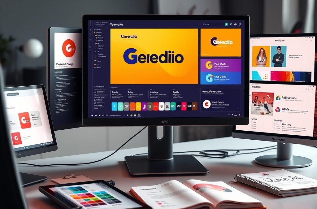
For aspiring and seasoned designers looking to master these principles and streamline their workflow, having a comprehensive toolkit is invaluable. The Graphic Design Bundle from DesignVault.store offers an incredible array of resources, templates, and tutorials designed to help you achieve professional-grade consistency across all your projects. It’s an all-in-one solution to elevate your visual branding game, providing the foundational elements you need to create stunning, unified designs with ease.
Practical Tips for Maintaining Brand Cohesion Across Platforms
Beyond defining your core elements, establishing practical processes is key to long-term consistency.
Develop a Brand Style Guide
A brand style guide is your holy grail for consistency. It’s a comprehensive document outlining all your brand’s visual and verbal rules.
- Include Everything: From logo usage and color codes (CMYK, RGB, Hex) to typography specifications, imagery guidelines, and even tone of voice.
- Share Widely: Ensure all team members, external designers, and marketing partners have access to and understand the guide.
Standardize File Naming and Organization
A disorganized asset library can quickly lead to inconsistent designs. Implement a clear file naming convention and folder structure for all your design assets, including logos, images, and templates. This makes it easy for anyone to find and use the correct versions of your brand elements.
Regular Audits and Updates
Periodically review your brand’s presence across all platforms – website, social media, print materials, emails – to ensure everything aligns with your style guide. As your brand evolves, be prepared to update your guide and communicate changes to maintain relevance and consistency.
Mastering consistent graphic design is not just about aesthetics; it’s about building a strong, recognizable, and trustworthy brand that resonates deeply with your audience. By meticulously defining your visual language, leveraging powerful design resources like the Graphic Design Bundle, and implementing clear guidelines, you can ensure every design decision contributes to a cohesive and impactful brand presence. Start applying these principles today to transform your brand’s visual story into one of undeniable strength and clarity.