
Ever wondered why some designs immediately capture your attention, while others simply fade into the background? The secret often lies in the masterful application of layout and composition – the unsung heroes of compelling visual communication. In the dynamic world of graphic design, these fundamental principles dictate how elements are arranged, guiding the viewer’s eye and conveying your message with clarity and impact. Understanding and implementing effective layout and composition techniques is crucial for anyone looking to create truly stunning and memorable visuals.
The Foundation of Visual Impact: Understanding Layout Principles
A strong layout is the backbone of any successful design. It’s about organizing visual elements in a way that is both aesthetically pleasing and functional. Think of it as creating a roadmap for your audience, ensuring they navigate your design effortlessly and absorb the intended information.
Defining Your Canvas: Grids and Guides
Grids and guides are indispensable tools for achieving precision and consistency in your layouts. They provide a structured framework, helping you align elements, maintain spacing, and create a sense of order. From simple column grids to more complex modular systems, mastering their use ensures your designs look professional and well-organized.
By consistently applying grid systems, you establish a visual rhythm that makes your designs easier to digest. This best practice in digital and print design not only enhances readability but also significantly speeds up your workflow by providing clear boundaries and alignment points.
Achieving Harmony: Balance and Alignment
Balance refers to the distribution of visual weight within a design. It can be symmetrical, creating a sense of formality and stability, or asymmetrical, offering a more dynamic and energetic feel. Proper alignment, on the other hand, involves arranging elements along common lines or axes, which instantly makes your design appear more organized and professional.
Understanding how different elements—text blocks, images, white space—contribute to overall balance is key. Experimenting with these concepts allows you to create layouts that feel harmonious and visually appealing, drawing the viewer in without overwhelming them.
Elevating Your Designs: Mastering Composition Techniques
While layout provides the structure, composition breathes life into your design. It’s about the artistic arrangement of elements to create a unified and impactful whole, going beyond mere organization to tell a story or evoke an emotion.
The Rule of Thirds and Golden Ratio
These classic compositional guidelines are powerful tools for creating visually engaging designs. The Rule of Thirds involves dividing your canvas into nine equal sections with two horizontal and two vertical lines, placing key elements along these lines or at their intersections for a more dynamic and interesting composition. The Golden Ratio, a mathematical proportion found in nature, offers an even more sophisticated approach to achieving aesthetic balance and harmony.
Applying these techniques can transform a static image into a vibrant scene, drawing the viewer’s eye naturally through the design. These principles are vital tips and tricks for creating stunning designs, applicable across various graphic design projects.
Harnessing Contrast and Proximity
Contrast in composition can be achieved through differences in size, color, shape, or texture, making certain elements stand out and creating visual interest. Proximity, conversely, groups related items together, signaling their connection and reducing visual clutter. Both are crucial for establishing hierarchy and guiding the viewer.
When elements are placed close to each other, the viewer perceives them as a single unit, simplifying complex information. Conversely, strategic contrast ensures that important details grab immediate attention, making your message unmistakable.
Guiding the Eye: Visual Flow and Dominance
Effective composition creates a clear visual path for the viewer, leading their eye through the design in a deliberate manner. This “visual flow” can be achieved through lines, shapes, and the strategic placement of dominant elements. A dominant element is the focal point, the first thing the viewer sees, around which other elements are arranged to support and enhance its message.
By consciously directing the viewer’s gaze, you can control the narrative of your design, ensuring that key information is absorbed in the intended sequence. This advanced technique helps in creating designs that are not just beautiful but also highly effective in communicating their purpose.
Practical Application: How to Use Graphic Design Tools for Composition
Bringing these principles to life requires a solid understanding of your chosen graphic design tools. Modern software offers an array of features that streamline the process of applying complex layout and composition techniques.
Leveraging Software Features for Precision
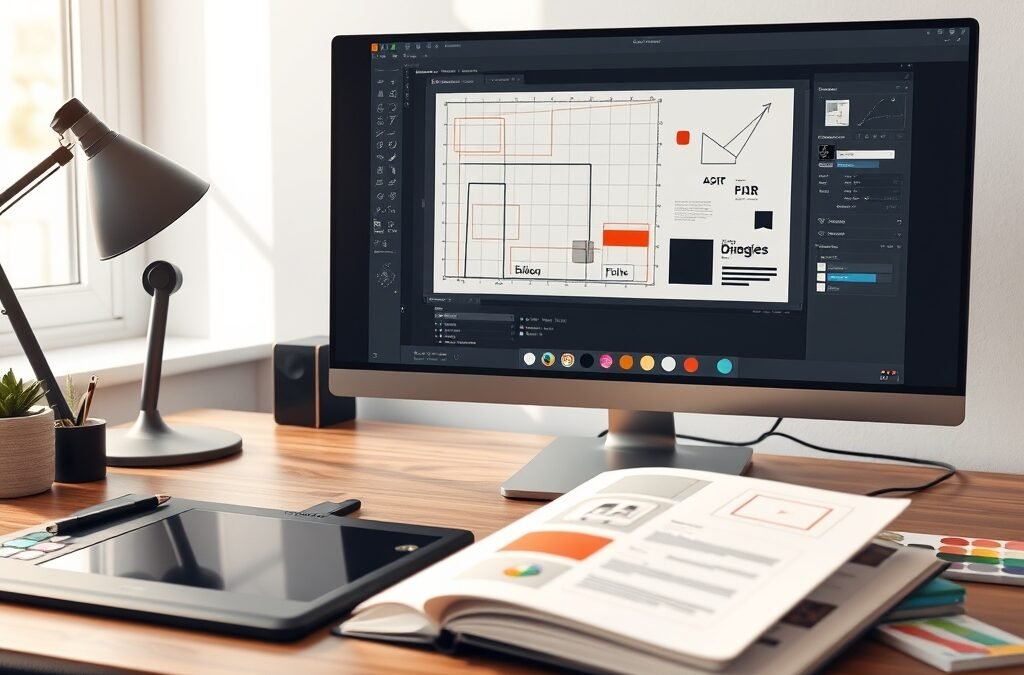
Most design software, like Adobe Photoshop, Illustrator, and InDesign, come equipped with robust features such as smart guides, alignment tools, and customizable grids. Learning how to effectively use graphic design tools like these can dramatically improve the precision and efficiency of your work. Utilize layer panels to organize elements, and explore grouping features to manipulate multiple objects simultaneously while maintaining their relative positions.
Experiment with different artboard sizes and orientations to see how your composition adapts. Don’t shy away from using the rulers and measurement tools to ensure pixel-perfect placements, especially when working on projects requiring specific dimensions.
Experimenting with Layouts
Before diving deep into a design, try sketching out various layout ideas or creating quick wireframes. This iterative process allows you to explore different compositional arrangements without committing too much time to a single direction. Digital mock-ups and mood boards can also help visualize how different elements will interact within your chosen layout. This is a powerful tip for creating stunning designs that truly resonate.
Accelerate Your Journey with the Ultimate Graphic Design Bundle
Ready to transform your understanding of layout and composition into breathtaking designs? Whether you’re a budding enthusiast or a seasoned professional looking to refine your craft, mastering these core graphic design principles is essential. To truly unlock your creative potential and gain access to a treasure trove of resources, tools, and expert insights, consider exploring the Graphic Design Bundle from DesignVault. This comprehensive collection is meticulously curated to equip you with everything you need to create visually stunning and impactful designs, from foundational knowledge to advanced techniques and practical assets.
The bundle provides an invaluable resource for anyone serious about elevating their design skills, offering tutorials and step-by-step guides for beginners and advanced users alike. It’s an investment in your creative future, empowering you to confidently tackle any design challenge with professional-grade results. Don’t just design; compose masterpieces that captivate and communicate.
By diligently practicing these layout and composition techniques, you’ll start seeing the world through a designer’s eye, noticing the balance, rhythm, and flow in everything around you. Apply these actionable tips to your next project, experiment with grids, balance, and visual hierarchy, and watch your graphic design work evolve from good to exceptional. The journey to becoming a design maestro is continuous, and every well-composed piece brings you closer to your creative peak.