
Ever wondered why some designs immediately capture your attention while others just fade into the background? Often, the secret lies not just in vibrant colors or compelling imagery, but in the subtle yet powerful art of typography. Mastering typography is a cornerstone of effective graphic design, transforming raw text into an engaging visual experience. It’s about more than just choosing pretty fonts; it’s about conveying emotion, establishing hierarchy, and guiding the reader’s eye seamlessly through your creation. For anyone looking to truly elevate their work and stand out in the competitive design landscape, understanding the nuances of type is an absolute game-changer.
Why Typography is the Backbone of Stunning Graphic Design
Typography is the silent storyteller of your design. It dictates the tone, personality, and professionalism of your message before a single word is even read. A well-chosen typeface can evoke trust, excitement, elegance, or playfulness, setting the stage for the entire communication.
Beyond aesthetics, typography is crucial for readability and user experience. Poor font choices, inadequate line spacing, or inconsistent kerning can quickly make a design frustrating to consume, leading to a high bounce rate and a lost audience. Conversely, thoughtful typography ensures that your message is not only seen but also effortlessly understood and appreciated.
Essential Graphic Design Tools for Typography Mastery
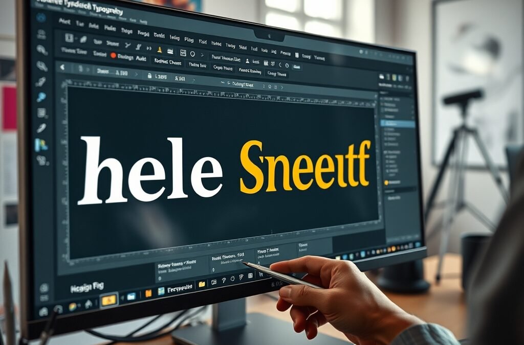
To truly excel in typography, you need access to the right graphic design tools. Software like Adobe Illustrator, Photoshop, and InDesign offer robust features specifically for type manipulation. These tools allow you to:
- Adjust kerning, leading, and tracking with precision.
- Experiment with a vast library of fonts, or even create your own.
- Apply effects, gradients, and textures to text.
- Work with variable fonts for dynamic stylistic changes.
Learning to navigate these powerful applications is fundamental. They provide the control necessary to transform ordinary text into extraordinary visual elements. The key is to understand not just how to use the features, but why certain adjustments are made to achieve a desired effect.
Tips and Tricks for Choosing and Pairing Fonts Like a Pro
Selecting the right font can feel daunting with thousands of options available. Here are some actionable tips:
Understand Font Classifications
- Serif fonts: Often convey tradition, authority, and readability for long-form text (e.g., Times New Roman, Georgia).
- Sans-serif fonts: Modern, clean, and versatile, great for headlines and digital screens (e.g., Arial, Helvetica, Open Sans).
- Script fonts: Evoke elegance, creativity, or a personal touch, best used sparingly for accents (e.g., Brush Script, Pacifico).
- Display fonts: Designed for impact, ideal for headlines or logos, but not for body text (e.g., specific artistic fonts).
Master Font Pairing
Effective font pairing often involves combining fonts that contrast yet complement each other. A common strategy is to pair a strong sans-serif for headlines with a readable serif for body text, or vice-versa. Aim for variety in:
- Contrast: Serif with sans-serif.
- Weight: Bold with light.
- Size: Large headlines with smaller body text.
- Mood: A serious font with a slightly more playful one, carefully.
Avoid pairing fonts that are too similar, as they can create visual confusion rather than harmony. Limit your design to 2-3 fonts to maintain consistency and avoid a cluttered appearance.
Best Practices: Ensuring Readability and Visual Hierarchy
Beyond choosing fonts, how you arrange and present them is critical. Here are some best practices for impactful typography:
Optimize Line Length and Spacing
For optimal readability, aim for 50-75 characters per line for body text. Too long, and the reader loses their place; too short, and the eye jumps too frequently. Adjust line height (leading) to be approximately 120-145% of the font size for comfortable reading.
Establish Clear Visual Hierarchy
Hierarchy guides the reader’s eye through your content, indicating what’s most important. Use variations in size, weight, color, and spacing to create distinct levels of information. Headlines should be the largest and boldest, followed by subheadings, and then body text. This creates an intuitive flow that makes complex information digestible.
Pay Attention to Kerning and Tracking
Kerning (space between two specific characters) and tracking (space across a range of characters) are subtle but vital. Poor kerning can lead to awkward gaps between letters, while inconsistent tracking can make text feel cramped or overly loose. Fine-tuning these aspects adds a professional polish that elevates your graphic design.
Unlock Your Full Potential with the Ultimate Graphic Design Bundle
Ready to take your design skills to the next level and confidently apply these typography principles? Access to comprehensive resources and high-quality assets is paramount. The Graphic Design Bundle from designvault.store is an invaluable resource for both aspiring and seasoned designers. It’s packed with tutorials, templates, and assets that will not only teach you the intricacies of typography but also equip you with the tools and knowledge to master every aspect of digital and print design.
Imagine having a treasure trove of design elements and expert guidance at your fingertips. This bundle is specifically curated to accelerate your learning curve, providing practical step-by-step guides and professional resources that cover everything from basic font principles to advanced layout techniques. It’s an investment in your creative future, empowering you to craft designs that truly resonate and achieve your vision with precision and flair. Start creating truly stunning visual communications today.