
Ever wondered what truly separates a good design from a breathtaking one? Often, the secret lies in the masterful application of typography and color theory. These two fundamental pillars of graphic design don’t just add aesthetic appeal; they communicate emotion, establish hierarchy, and guide the viewer’s eye, turning simple visuals into powerful messages. For anyone looking to create stunning designs, understanding and skillfully using these elements is not just an advantage—it’s essential for impactful visual communication.
The Unseen Power of Typography in Graphic Design
Typography is far more than just choosing a font; it’s the art and technique of arranging type to make written language legible, readable, and appealing when displayed. Your font choice, size, spacing, and arrangement can dramatically alter how your message is perceived. A sophisticated serif might convey tradition and elegance, while a clean sans-serif speaks to modernity and efficiency.
To truly harness typography, consider its role in visual hierarchy. Larger, bolder fonts naturally draw attention, signaling importance. Conversely, smaller, lighter fonts recede, perfect for secondary information. Effective type pairing involves selecting two or three complementary fonts that work harmoniously without competing. Think about contrast in style, weight, and size to create visual interest and clear distinction between different pieces of information.
Unlocking Emotion with Color Theory
Color is a universal language, capable of evoking specific emotions and associations without a single word. Mastering color theory means understanding how colors interact, their psychological impact, and how to combine them to create compelling palettes. For instance, warm colors like reds and yellows often convey energy and passion, while cool colors such as blues and greens suggest calm and professionalism.
Creating an effective color palette involves more than just picking your favorite hues. Explore color harmonies such as complementary (colors opposite on the color wheel for high contrast), analogous (colors next to each other for a harmonious feel), or triadic (three colors evenly spaced for vibrant balance). These principles provide a framework for creating visually appealing and emotionally resonant designs, whether for branding, web interfaces, or print materials.
Practical Tips for Integrating Type and Color
Combining typography and color effectively is where the magic happens. Here are some actionable tips:
- Prioritize Readability: Always ensure sufficient contrast between your text color and background color. High contrast is crucial for legibility, especially for body text.
- Limit Your Palettes: Resist the urge to use too many fonts or colors. A cohesive design often sticks to 1-3 fonts and a well-defined color palette to maintain consistency and avoid visual clutter.
- Use Color to Highlight: Employ accent colors to draw attention to key headlines, calls to action, or important data points within your text.
- Consider Accessibility: Design with all users in mind. Ensure your color choices and text sizes meet accessibility standards so your message is clear to everyone.
- Maintain Brand Consistency: If designing for a brand, adhere strictly to established typography and color guidelines to reinforce brand identity.
Elevating Your Designs with Professional Tools
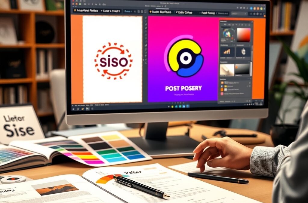
Knowledge of typography and color theory is powerful, but it’s the professional graphic design tools that allow you to bring these concepts to life with precision and creativity. Software like Adobe Photoshop, Illustrator, and InDesign provide unparalleled control over every aspect of your design, from kerning individual letter pairs to crafting intricate color gradients. Learning to navigate these tools efficiently empowers you to execute your vision flawlessly and achieve truly stunning designs.
While the learning curve for professional design software can seem daunting, the investment in mastering these tools is invaluable. They unlock a world of creative possibilities, enabling you to apply advanced techniques and refine your work to a professional standard. With the right resources, you can transform your theoretical understanding into practical, high-quality output.
Beyond the Basics: Advanced Techniques for Stunning Designs
Once you’ve grasped the fundamentals, you can delve into more advanced typography techniques like adjusting kerning (space between specific letter pairs), leading (space between lines of text), and tracking (overall letter spacing) to perfect the visual rhythm of your text. For color, explore gradient meshes, blending modes, and texture overlays to add depth and sophistication. Experimentation is key to developing a unique style and pushing the boundaries of your creative work.
Your Path to Graphic Design Mastery Starts Here
Mastering typography and color theory, combined with proficiency in professional design tools, is your gateway to creating truly impactful and memorable graphic designs. Whether you’re a beginner eager to learn the ropes or an experienced designer looking to refine your skills, comprehensive resources are essential. To accelerate your journey and gain access to a wealth of tutorials, assets, and expert insights, consider exploring the Graphic Design Bundle. It’s designed to equip you with everything you need to transform your creative ideas into professional-grade visuals.
Start applying these principles today, even in small ways, and observe the immediate improvement in your work. The journey to becoming a proficient graphic designer is continuous, filled with learning and practice. By investing in your skills and utilizing top-tier resources like the Graphic Design Bundle, you’re not just learning; you’re building the foundation for a successful and creatively fulfilling career in visual communication. Take the leap and elevate your design capabilities to create visuals that truly resonate and leave a lasting impression.